SAMUEL ADRIAN
Multimedia Designer
Branding
Creating visual design for a fictitious digital marketing event occurring in Vancouver
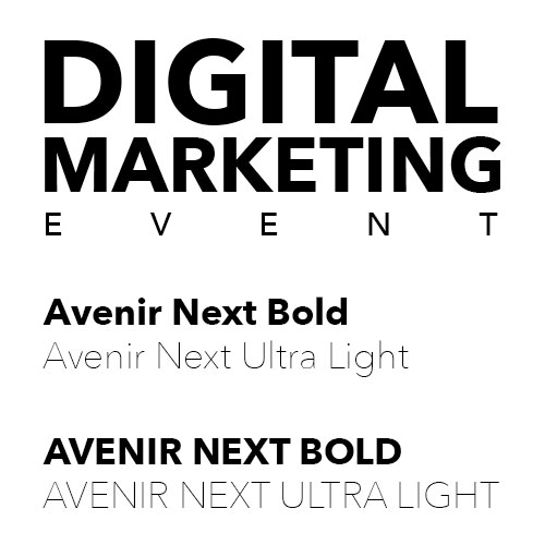
Typography
Avenir Next Bold & Ultra Light ALL CAPS
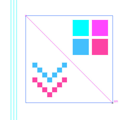
Colours
Inspired by digital guides and grids
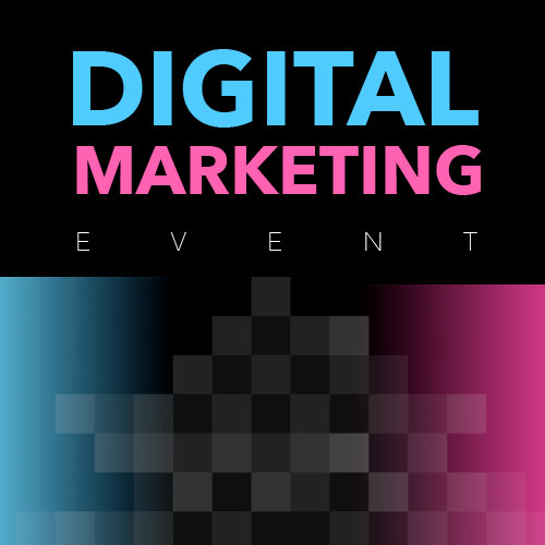
Logo and other elements
Digital related
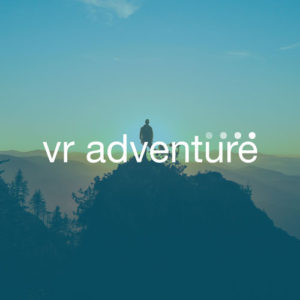
Imagery
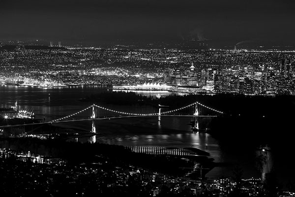
Looking for a scenic skyline representative for the event location
Personal photography library – Canon 6D, 70 – 300 mm – Long exposure
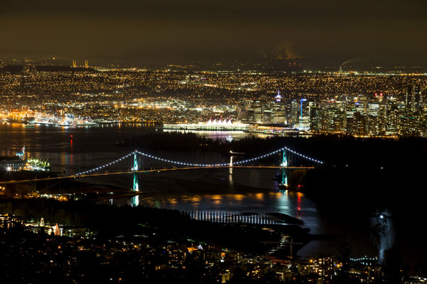
Option 1 – winner
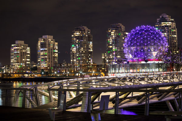
Option 2
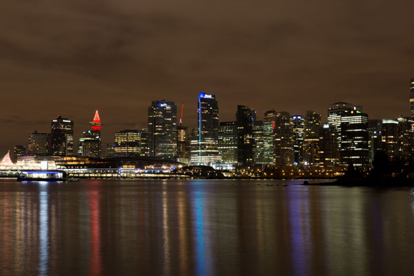
Option 3
Using Black & White filter so I can apply other colour treatments
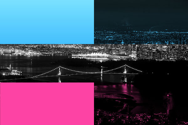
Adding branding colours
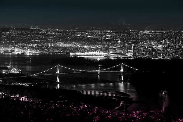
Refining the final look of the image
Mockup Layout
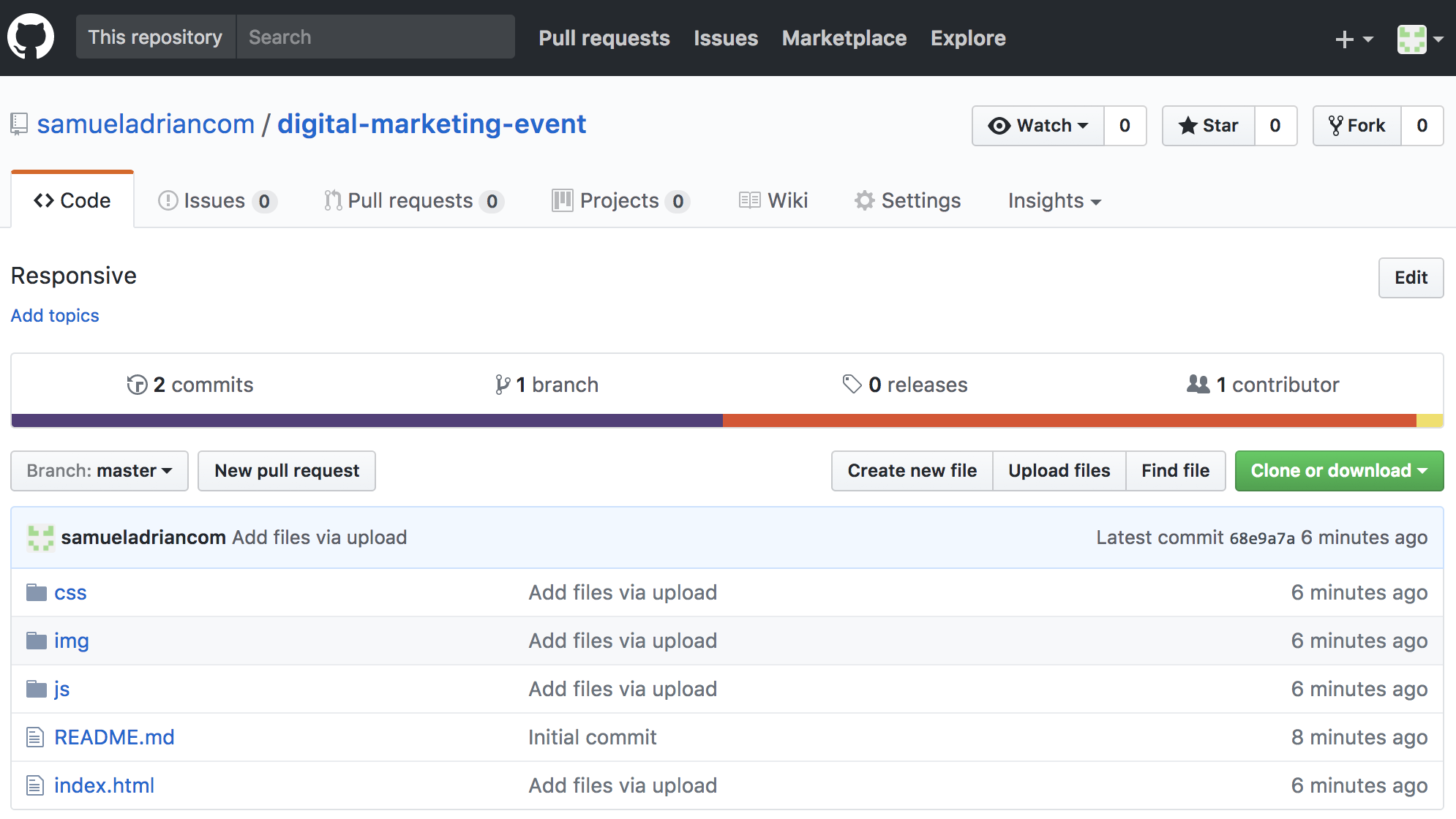
Design Process: Mobile first
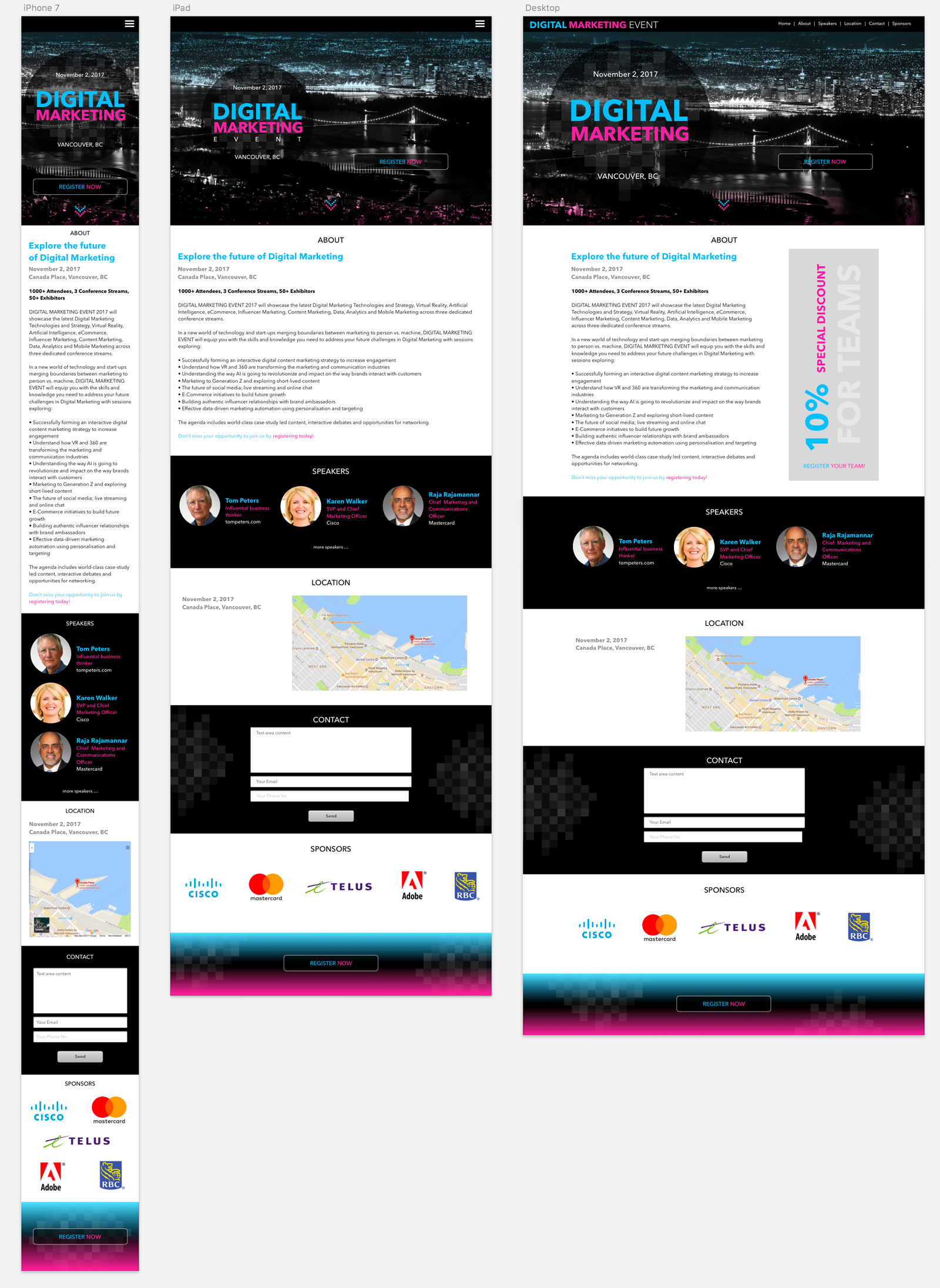
HTML, CSS, JavaScript
First concern: Responsive
More Projects